But why am I solving this problem?
I use laundry apps for dry cleaning my quilt and delicate clothes on a monthly basis. From my personal experience as well as a competitive analysis of 7 mobile apps in India, I found the following issues:
- The visual design and user experience was lacking
- 6 out of 7 apps are just used for scheduling pickups; and do not have any other use case, like an order tracking functionality. Only 2 of them let us choose a delivery date
- 6 out of 7 apps do not provide a direct way to get a rough estimate of the order amount. They only provide a price chart to manually calculate it
Tumbledry
Laundrokart
UClean
Who is this app for?
The target customers are people who use professional laundry services for specific needs or constraints.

Sunny
Cannot invest in a washing machine
(cost-conscious customer)

Rahul
Does not have time to manage weekly laundry
(time-constrained customer)

Sneha
Owns duvets that require dry cleaning
(special-treatment customer)
Constraints that shaped the product design
Since this was a personal project, I defined a couple of business and operational constraints to make design decisions more realistic.
The company owns all the necessary equipment and employs trained staff at a centralised store.
Assumption 1
The company hires gig workers for pickup and delivery instead of maintaining an in-house fleet, helping reduce operational costs.
This enables order pickups would happen just in time, within 2 hours. Scheduled pickups would be available as a fallback option.
Assumption 2
The company offers four standard laundry services that covers most laundry needs and helps the product stay competitive with existing apps:
- wash
- wash + iron
- iron
- dry clean
Assumption 2 leads to the next question: how should the company price these services?
Based on a competitive analysis of the service-wise pricing strategies of 7 laundry apps in India, I found the following:
- iron and dry clean: all 7 apps follow per-item pricing.
- wash and wash + iron: 6 out of 7 follow weight-basis (per kg) pricing, while just 1 of them follow per-item pricing
For iron and dry clean, the company will follow the per-item pricing. However, for wash and wash + iron, the company has two possible pricing options:
Option 1 : weight-based pricing
Ideal for optimising bulk item intake and improving wash load efficiency.
Option 2 : per-item pricing
Offers greater control over unit economics, since different items require different levels of handling. For example, ironing a blazer is more labour-intensive than ironing a T-shirt.
Since FreshFold is an early-stage startup with likely funding constraints, I chose Option 2. This means all 4 services will follow per-item pricing.
The trade-off was that per-item pricing increases selection effort for customers. However, it also enables clearer pricing and more accurate order verification during pickup.
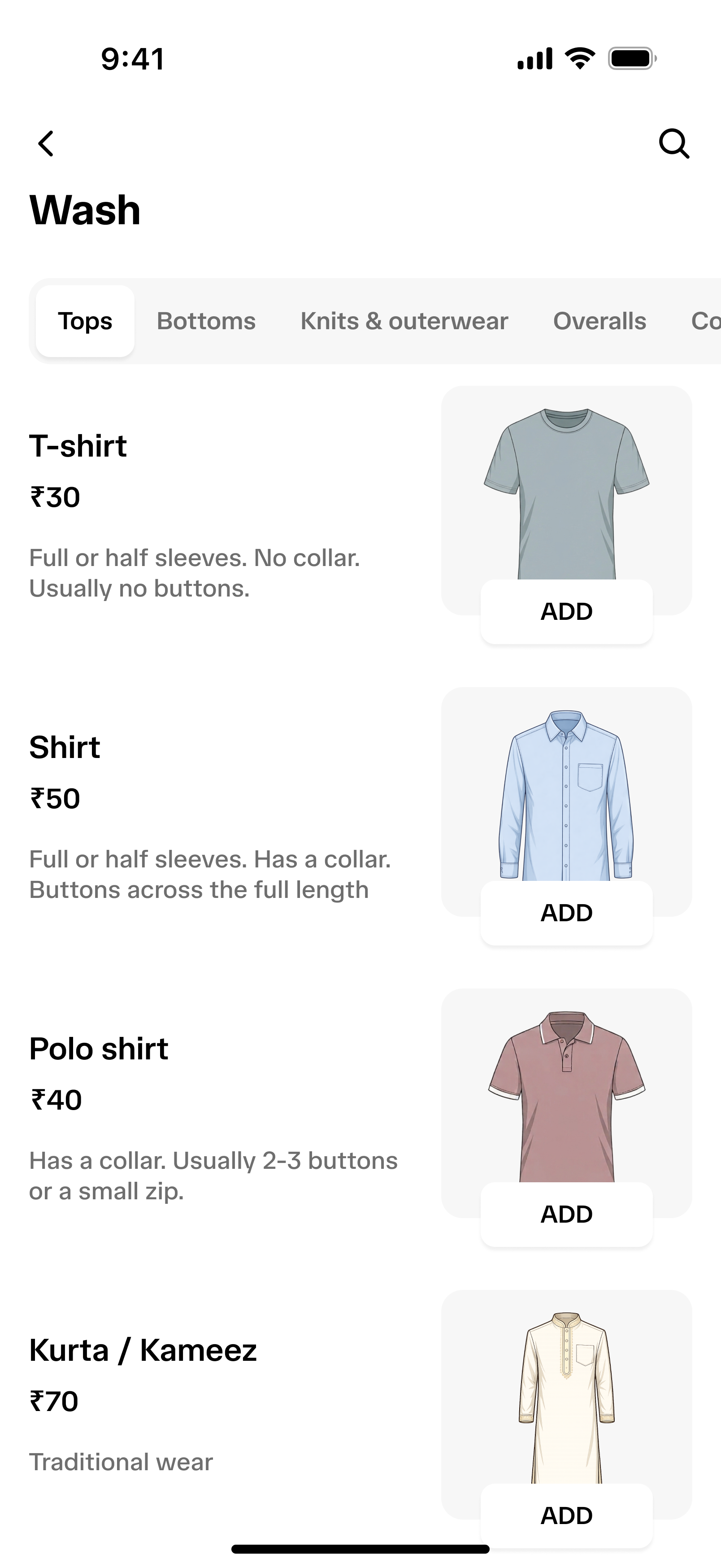
In practice, the customer sees the exact order cost along with the item count for each item, while placing an order. For example, instead of seeing “3 kg of clothes for wash + iron,” customers would see “3 shirts, 2 bedsheets, and 2 ties for wash + iron.”
How does a customer know whether to choose wash or dry clean for a clothing item?
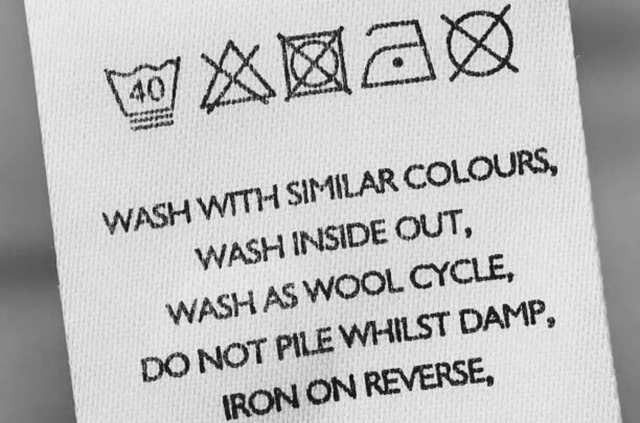
The garment care label is the source of truth when choosing the relevant service. However, if the care label is missing or unclear, the app needs to provide general guidance to help customers make a more informed choice.
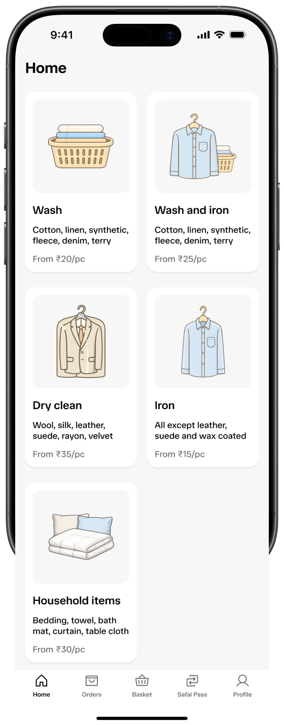
This insight guided the design of the app’s home screen.
Customers may not immediately realise that the company also services household items.
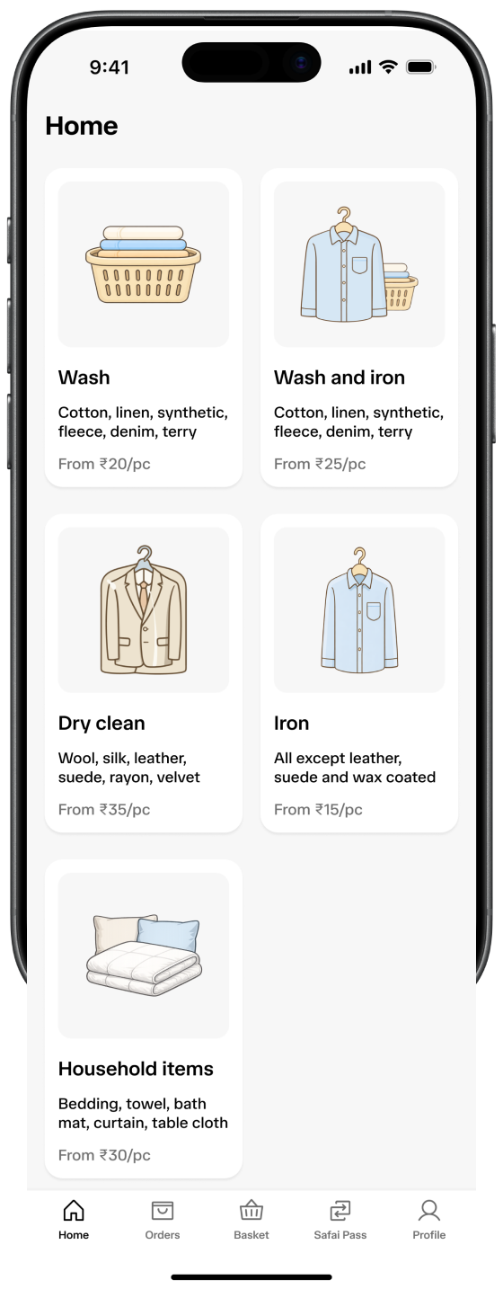
Fabric information helps customers choose the most relevant service
Exploring different visual directions for the item selection screen
Not every design made it to the finalWe arrive at this screen by selecting any service from the home screen
Home screen : services
Iteration 2
Arriving at the final iteration
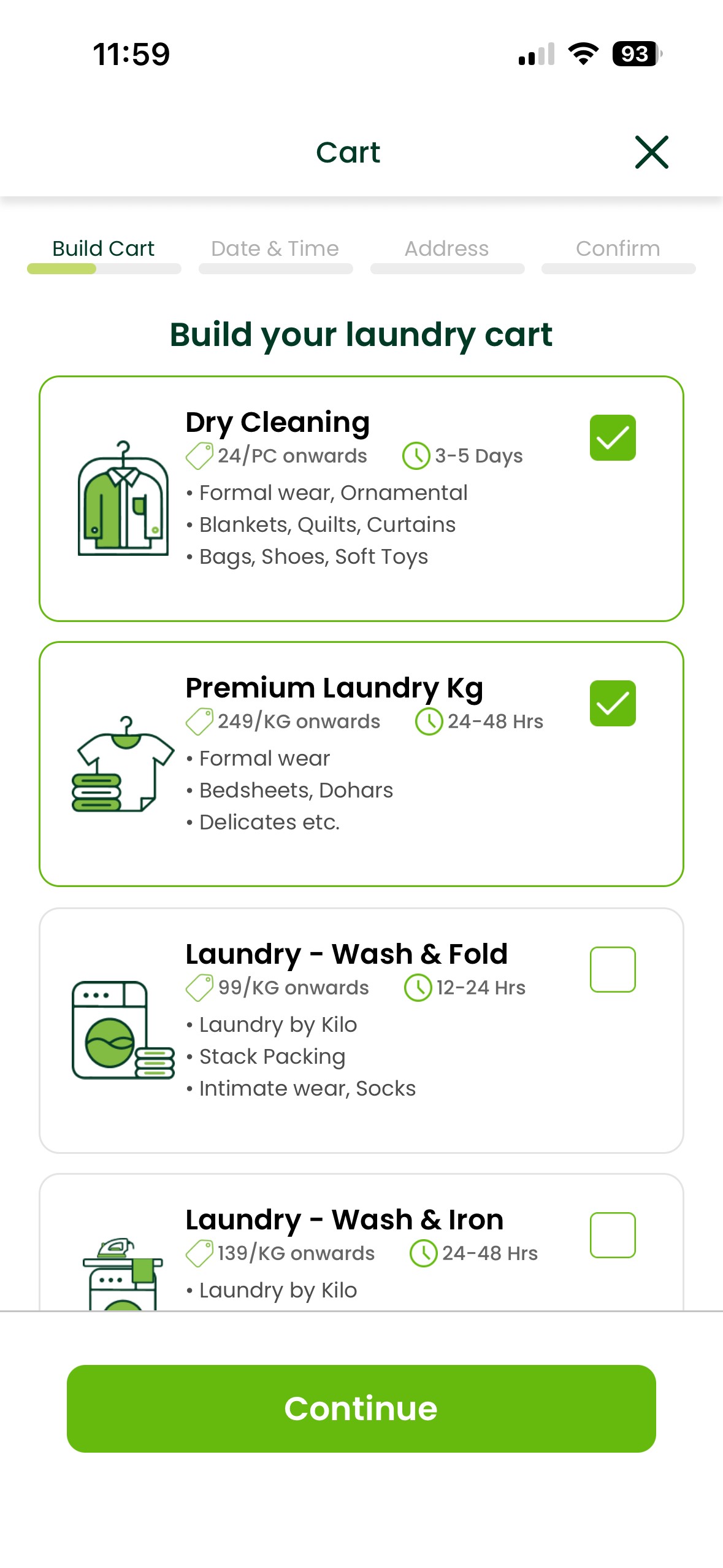
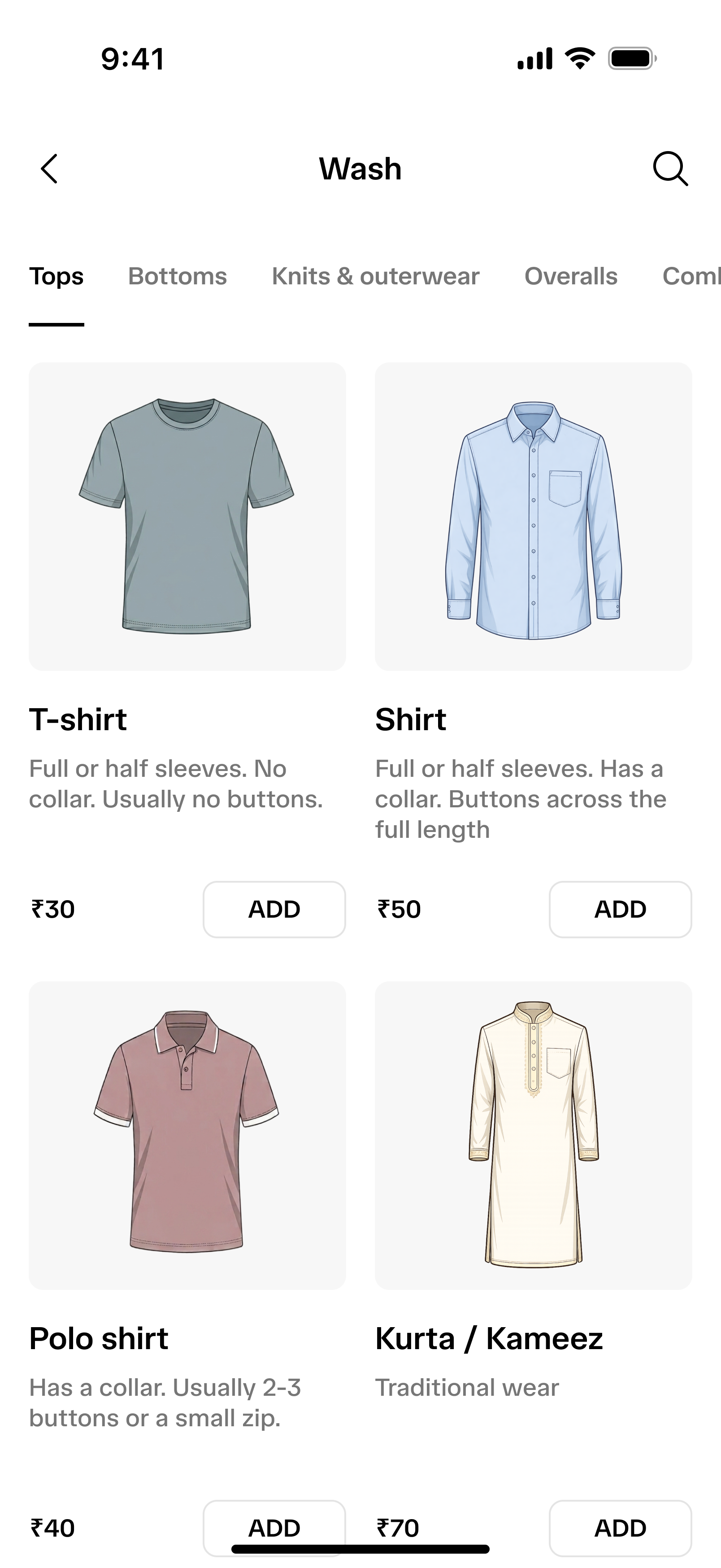
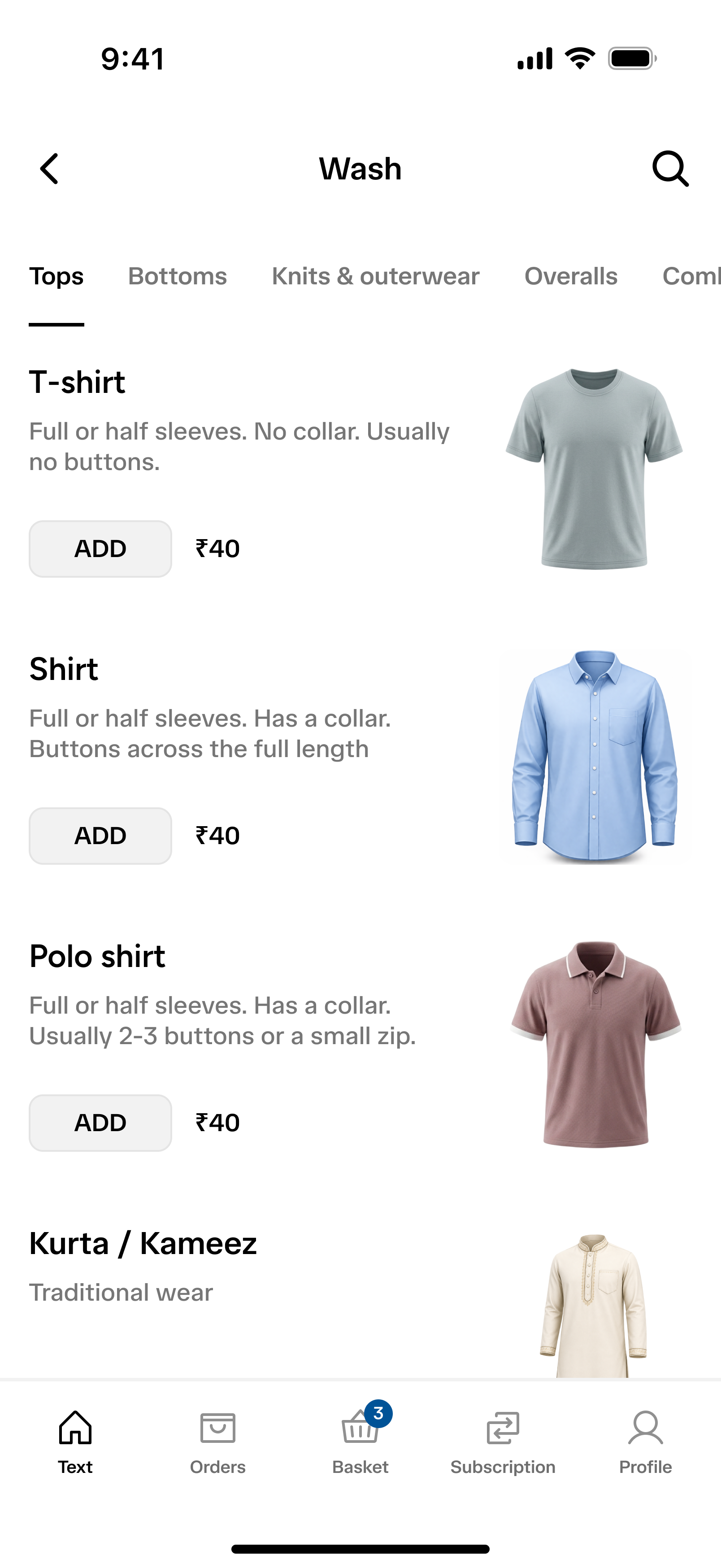
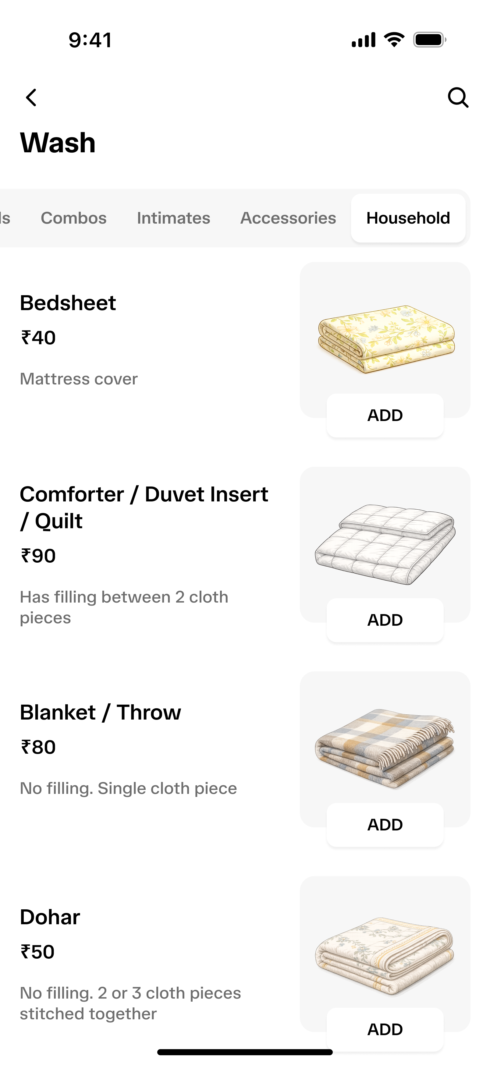
Customers arrive at this screen after selecting a service from the home screen.
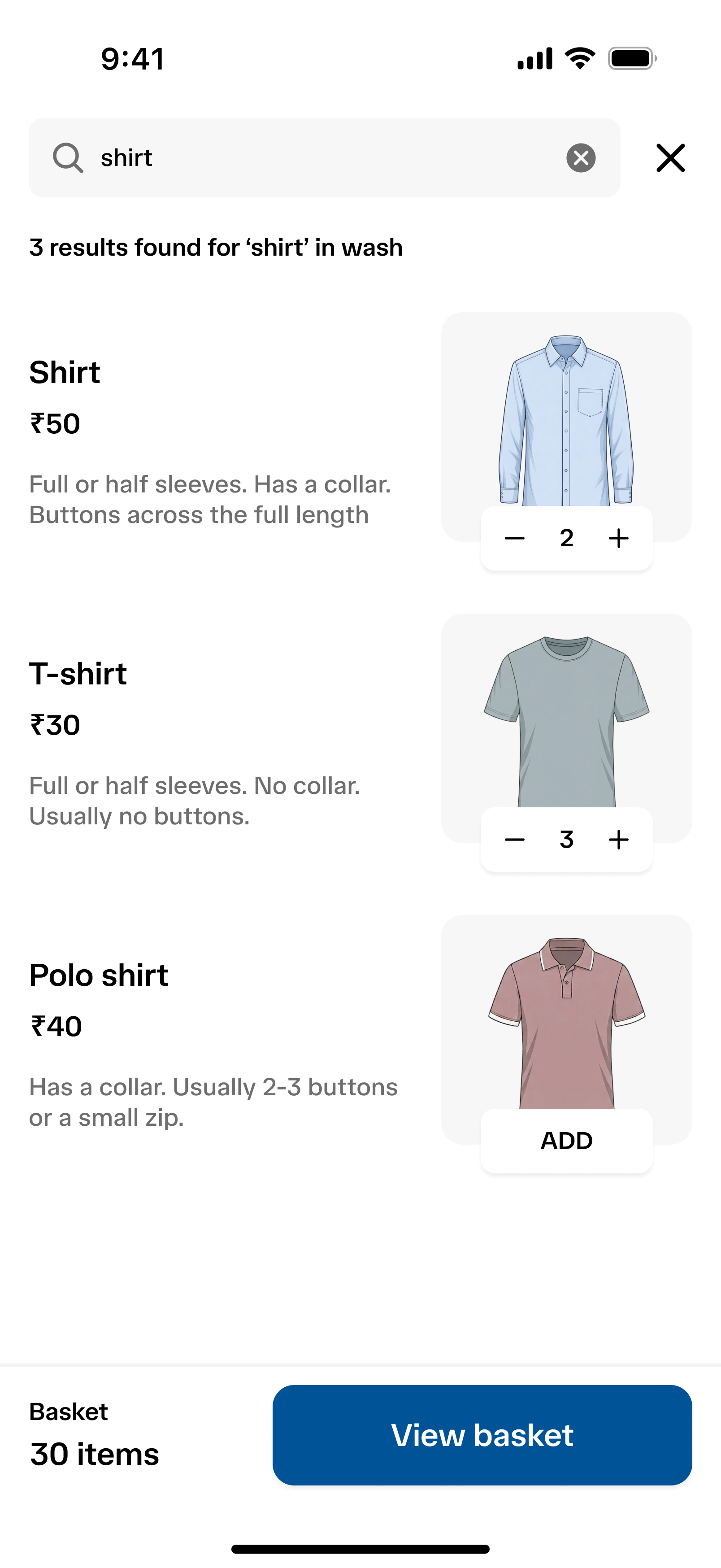
The main challenges were helping customers select many items quickly as well as eliminating any confusion. For example: a customer might not be aware of the difference between a duvet and a dohar.
Since the customer selects quantity for each item. So during pickup the rider verifies the count for each item, except for undergarments.
Grouping similar items together
Relevant description to differentiate between items with similar functionality

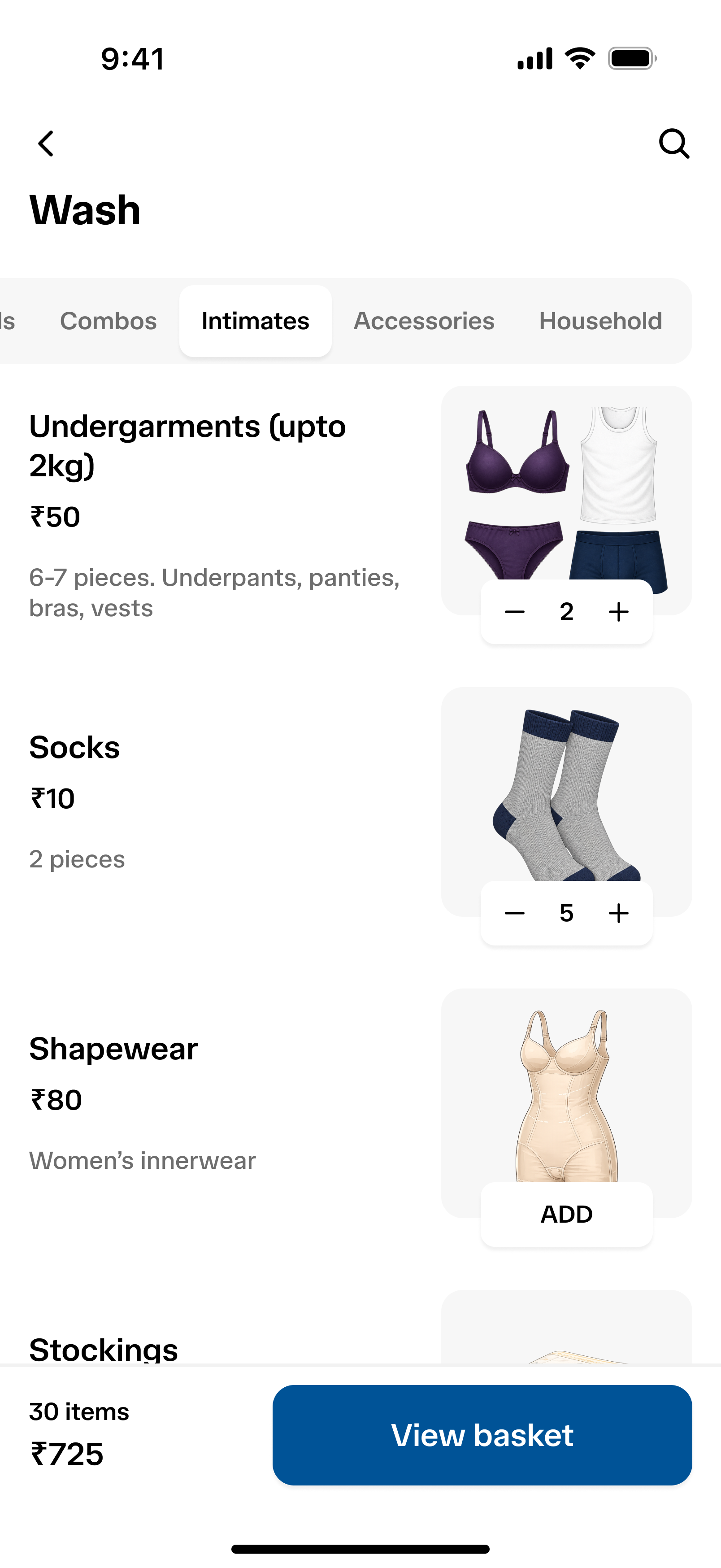
To prevent awkwardness while counting items during pickup, undergarments are measured by weight.
Illustrations support quick item recognition and selection.
Home screen : services
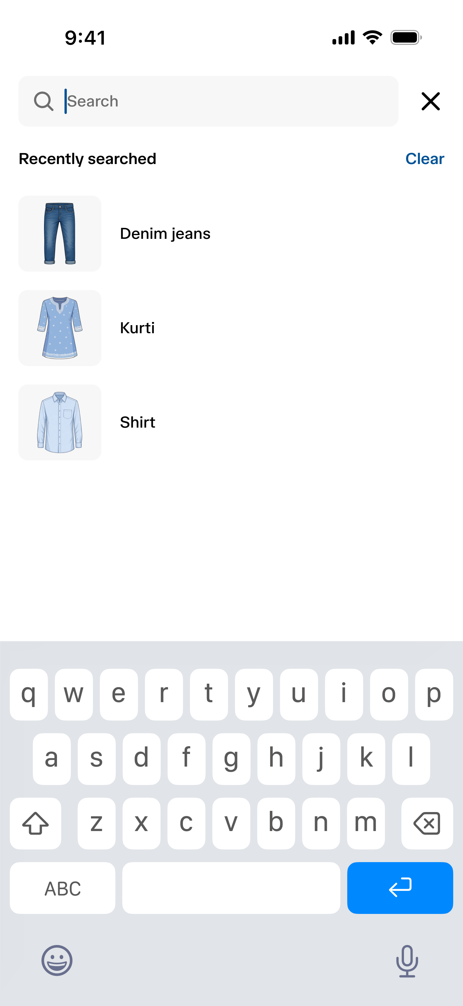
Search experience: happy flow
Item search experience
Customers can search for an individual item, such as a shirt, or for a specific category or use-case, such as ethnic wear or office wear.
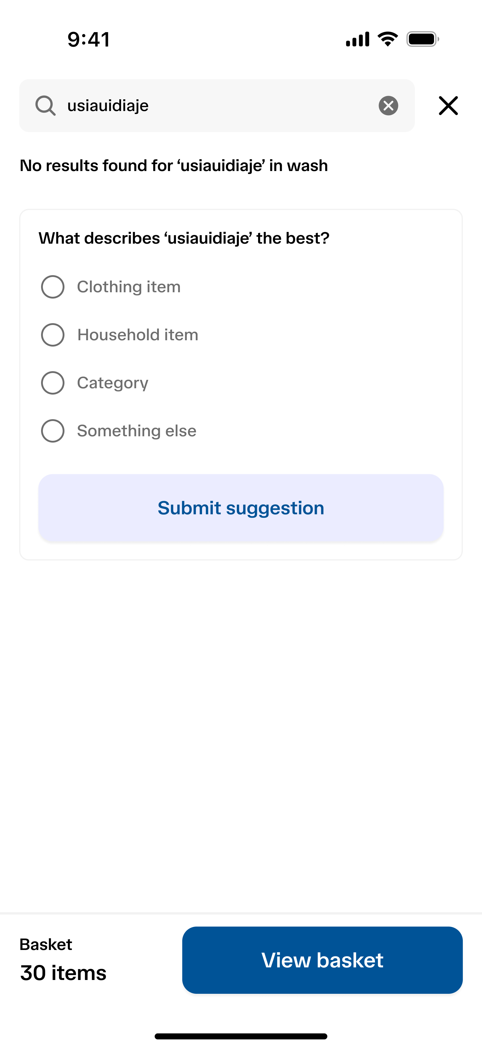
Fallback while searching
If customers cannot find a specific item, they can submit it as a suggestion. The customer support team would review the suggestion and add it to the item list if needed.
Search experience: happy flow
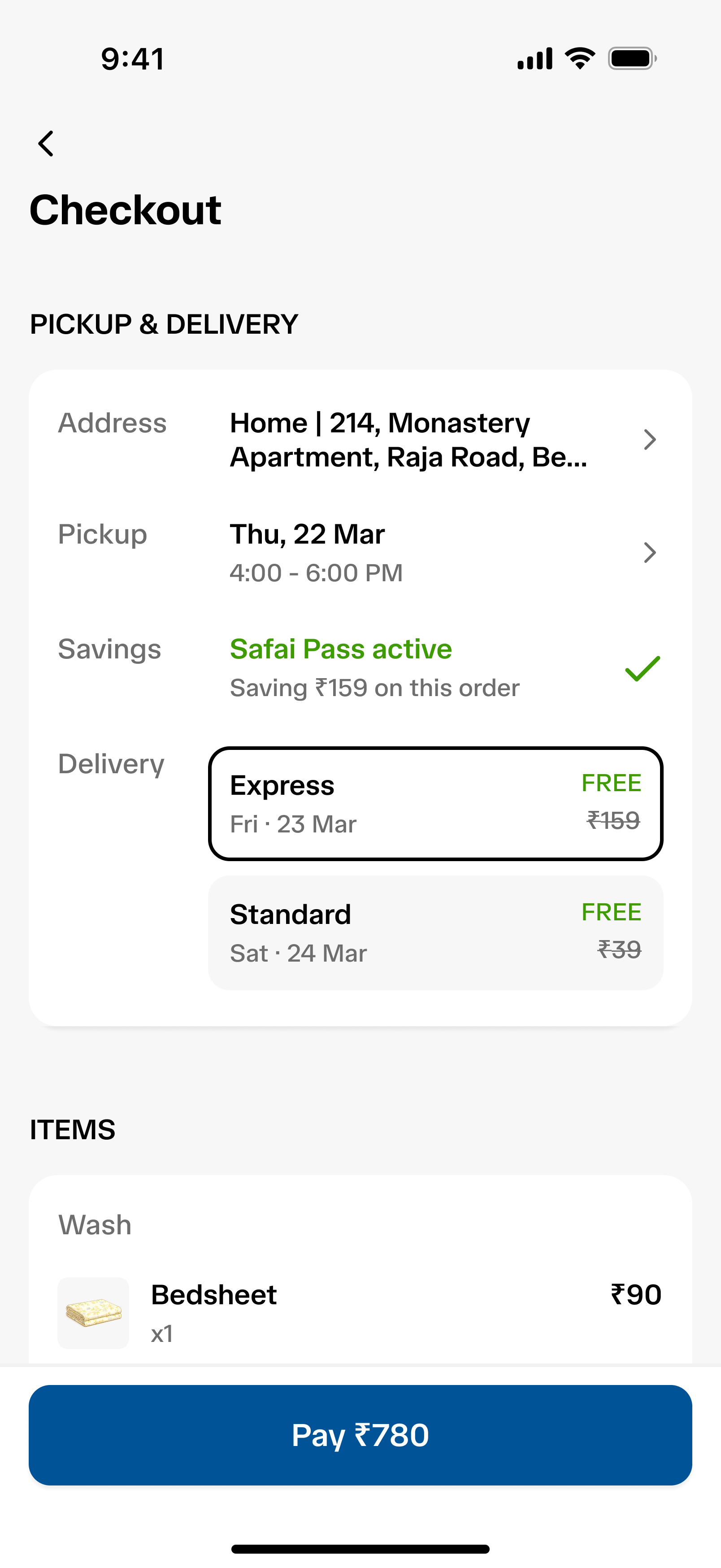
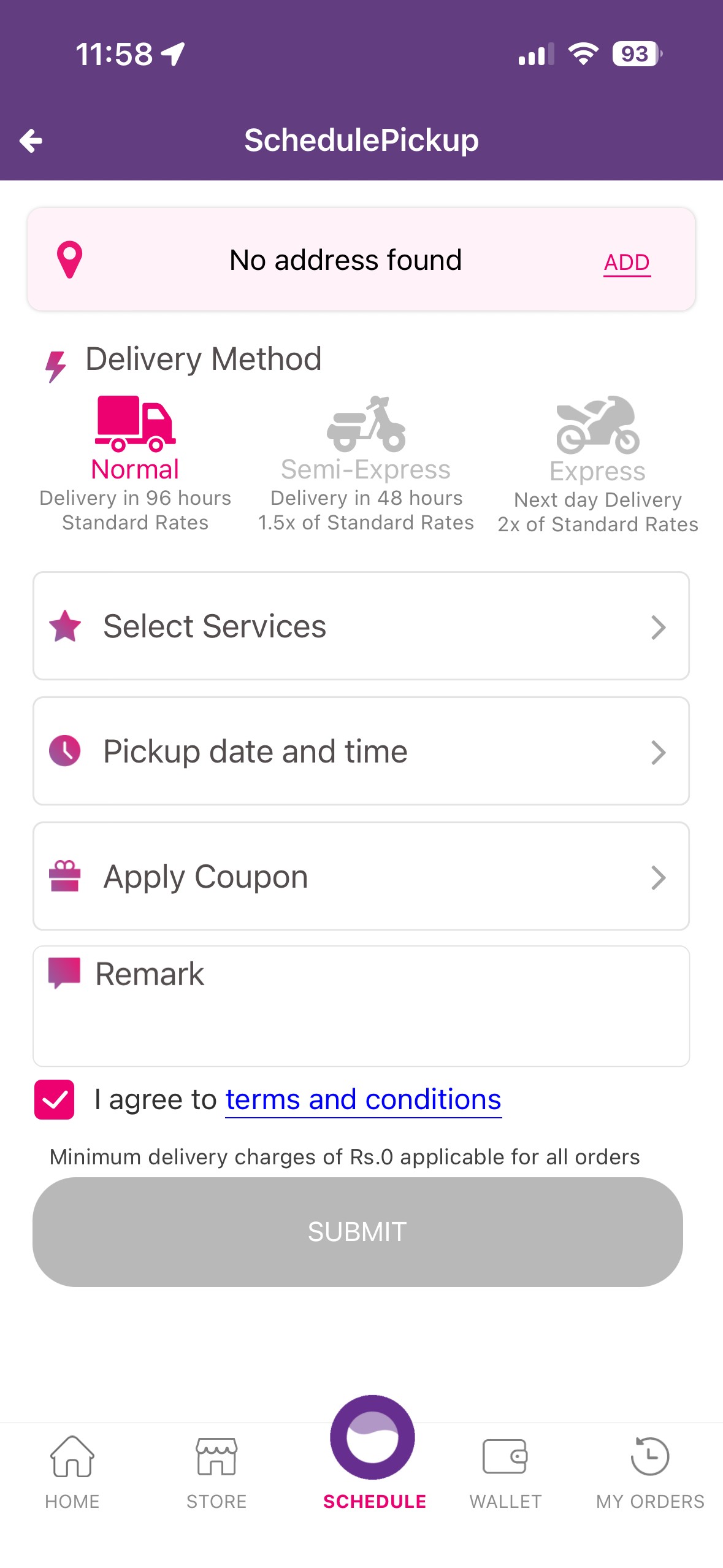
Basket and checkout experience
I assumed that customers would place high-volume orders, typically around 10–15 items. To support this, I added separate steps for reviewing items in the basket and completing the checkout process.
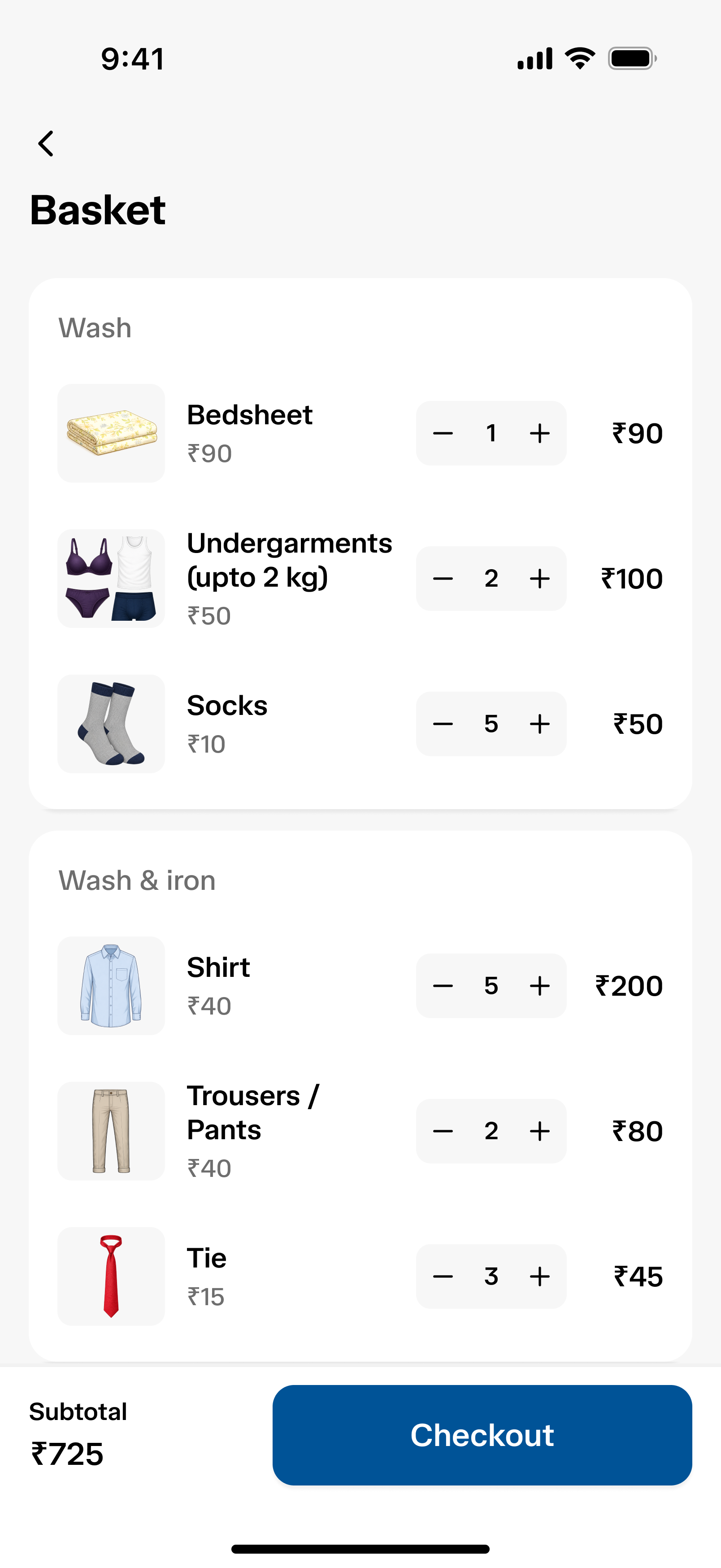
Basket screen
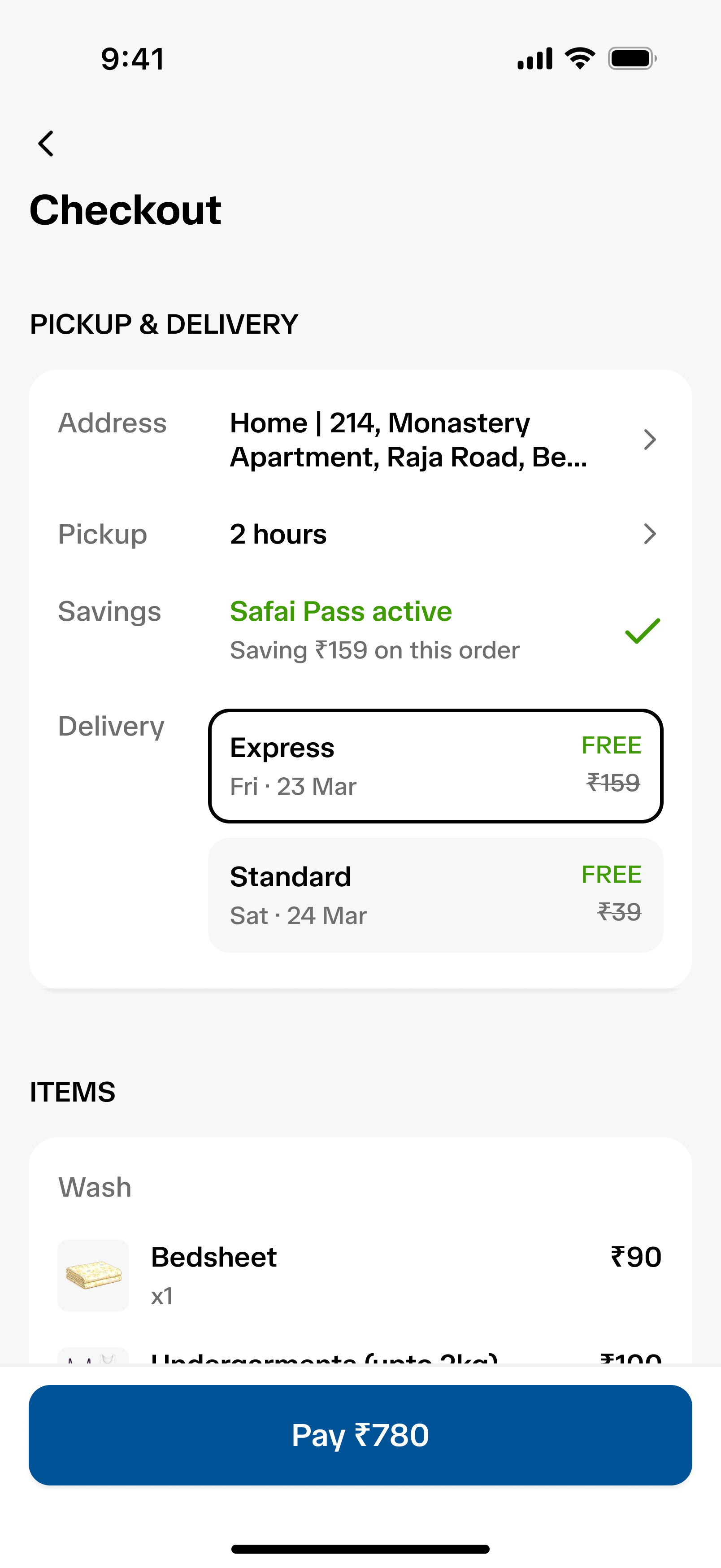
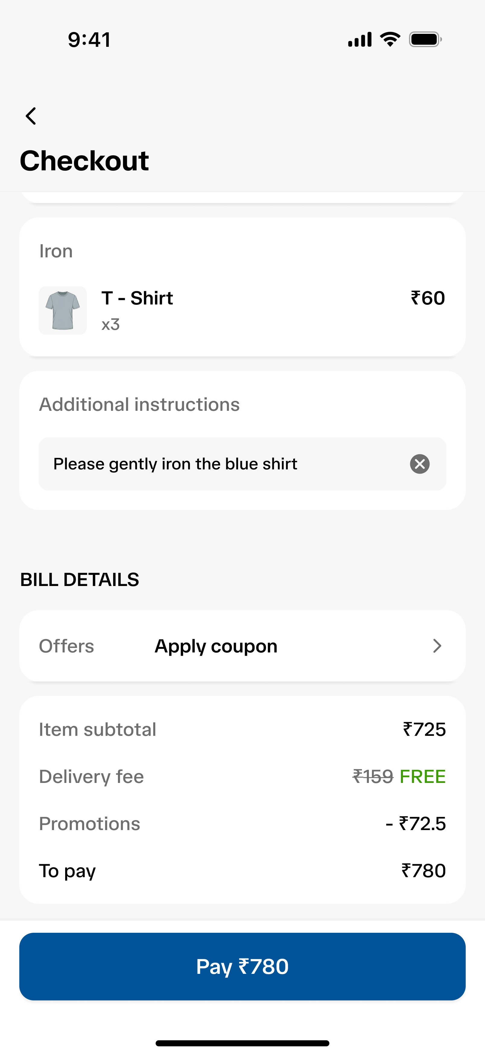
Checkout screen
Order tracking
After placing an order, customers can view its progress on the tracking screen. Depending on the order status, they can contact support, call the rider, or cancel the order.
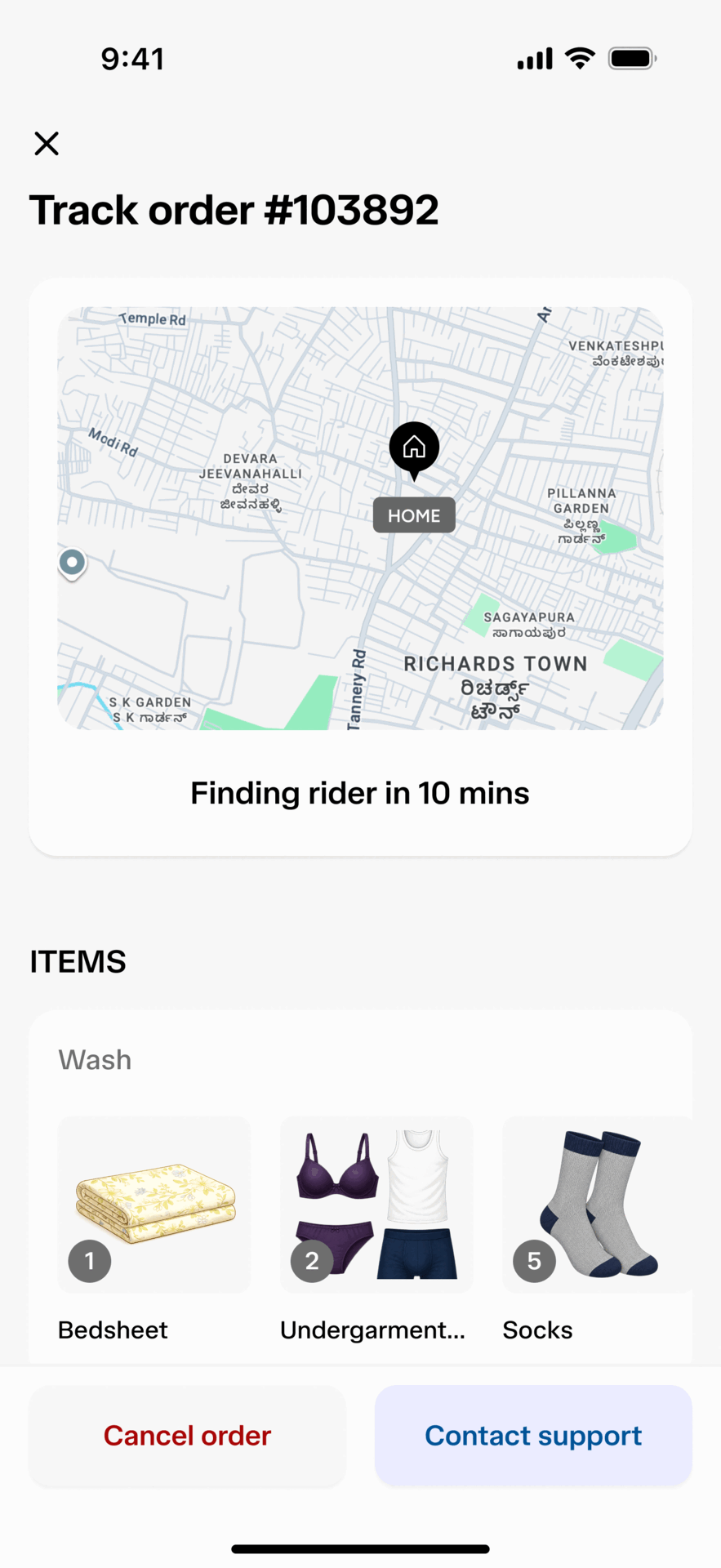
Order tracking prototype
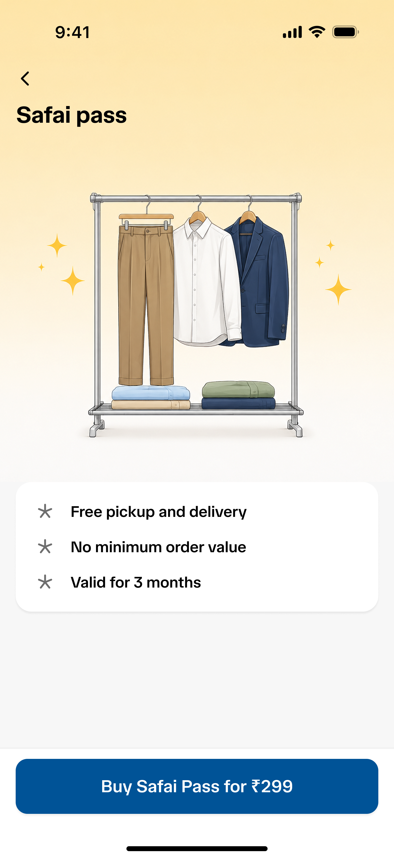
Subscription service: Safai Pass
This is similar to what food delivery apps like Swiggy and Zomato offer. Customers can either add it during checkout or buy it through subscription page.
Inactive subscription state
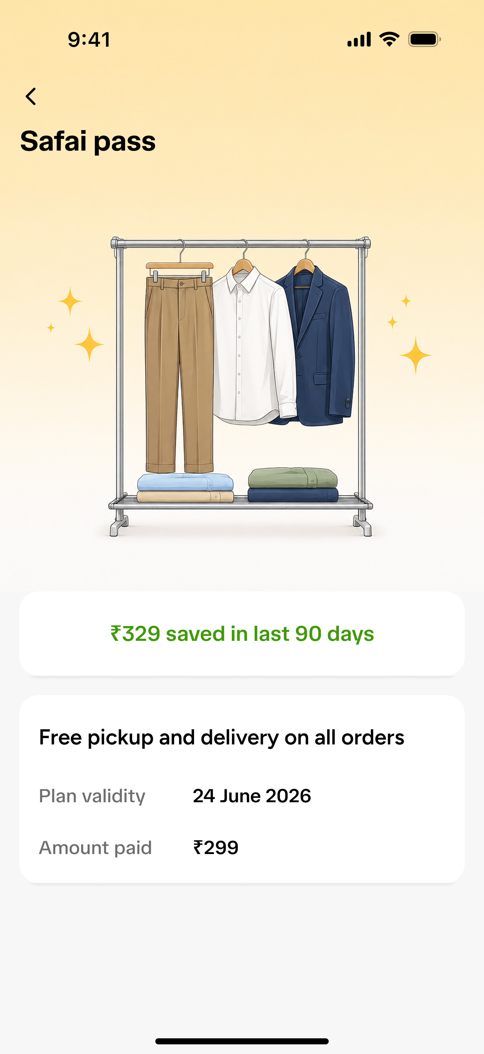
Active subscription state
My learnings from designing this application
- Always start by researching the problem statement. Organise the data and list the assumptions before moving into design.
- Iterate on designs and seek continuous feedback from mentors to improve visual design, user experience and the overall flow.
- I learned not to get attached to one solution too early. Evaluating the trade-offs of different approaches helped me make better design decisions.